New Jugs: The Milk Design Soap Opera
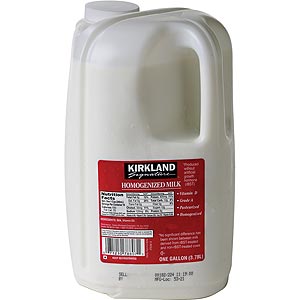
 This bottle is not the topic for this post, apologies for not having a worthy photograph in my archives. That being said, in the past few weeks I’ve notice a number of people voicing their opinions about a new milk jug design.
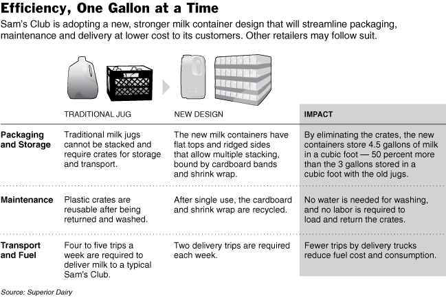
  Milk jugs are something you do not notice, you take the design for granted and maybe it’s just me, but I’ve never appreciated the thought process that goes into such an everyday item. For those of you not following the news, here’s some background. Sam’s Club and Costco have introduced a new container for milk (pictured on the right) and it greatly reduces the packaging and transportation needs. This essentially is just a more efficient design that saves the company money by cutting back on costs, but it also reduces the environmental needs of transportation. It may not seem like a big deal, but for bulk stores like these those carbon footprints are massive. The New York Times first had a big article about the “controversy” surrounding the new jug and even went so far as to interview people about their feelings. This article spurred trickle down articles and many blog posts bemoaning the hardships of the new jug. In the NYT’s article they included a handy graphic that lays out the issue, I’ve included it for the visual learners (like me):

At first I thought this was a comical story of a distraught housewife who couldn’t cope with small changes to her routine and maybe, just maybe, it was worthy of a local news story…but the New York Times? Turns out, this is actually a big deal in America. Retailers are running an opinion poll about the new design and Sam’s Club even went so far as to offer “Milk Pouring Classes.” Before going off on some rant about the density of the American consumer, I’d just like to say that I’ve been using this newfangled contraption since it’s debt and my reaction was simply, “Huh? Crazy looking jug.” End of story for me. I had no idea that there were all these environmental benefits and I had even less of an idea of the militant opposition brewing in America’s heartland.
The point of this piece is this: if someone comes out with a design that improves upon the old one, it should be released and accepted. It would be one thing if it’s fashion or some sector based at all on appearances, but milk jugs are nowhere near that spectrum. One of the designers on the project stated “We designed this bottle all about the function…it’s designed to be exactly what it is should be, tight compact and fitting a function. It’s not [meant] to be a bottle of wine.” I say, let the new jug travel far and wide, bringing bovine lactate throughout the land. For the naysayers, learn to tilt the jug instead of pouring upsidedown or however you could mess up pouring milk (I’m looking at you Amy Wise).
1 Comment
Permalink
TWERKLAND SIIIIIG