This Here: Local Data
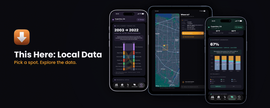

Today, my passion project, a free app called “This Here: Local Data,” is available in Apple’s App Store. Go download it! You can pick any spot in the US — your block, a place you’re thinking about moving to, or somewhere you’re just curious about — and see what the data actually says about it. The core functionality is:
- Tap anywhere in the country to explore it.
- Check out dozens of data visualization “cards” about local residents, housing, environment, history, and more.
- Compare any place to your own hometown.
- Customize the views to reorder or add and remove information, based on your interests.
- No account, no ads, no in-app purchases, no notifications — just real information, made readable. Completely free.
This Here turns real data about people, housing, weather, nature, and history into something you can enjoy browsing and learning more about. Drop a pin anywhere in the country and get a real picture of that place in seconds.
Background
I keep lists of little ideas I have. They are, variously, curmudgeonly (“Sock companies should let you buy a single sock if you lose one!”), implausible (“Create a garden hose with measuring tape markings?”) or niche (“Build an app like Untappd for dog breeds instead of beer”). But one constant has been an entire section of ideas for if I ever had the chance to work on a project called Sitegeist again.
Sitegeist was a short-lived app that I helped with while I worked at the Sunlight Foundation. It was part of a series of “National Data Apps” to help people understand and use publicly available data. Even though it was well received, the funding was not there for continued development, and a Kickstarter didn’t reach the goal. Without updates, the app became less usable and, just two years after launch, Sitegeist was removed from app stores. I was crushed — not only was the app fun to work on and gaining traction from users, but I loved using it and suggesting improvements. When I traveled to a new place, I would open the app to find something interesting about the area, or look up data when a location was mentioned. Most apps focused on location were limited to directions, or ways to spend money: real estate, events, stores, and restaurants. The simple idea of showing underlying data about a location to learn more about it resonated with me, and I haven’t seen another app that presents complex local data in a fun-to-browse format.
First Phase: App for One, Please
For years, I somehow missed that you can build an iOS app and run it locally without needing an Apple Developer account or publishing it to the App Store. As the process of coding became more accessible, I realized I could turn that section of my scribbled dreams for an app into something real. The conceptual phase was a process spanning more than a decade, but the actual building process has been under a year. I have deliberately gone slowly so I can learn and understand as I go. I love using it for myself, and tinker with it constantly. This is the app I had dreamed of for so many years, and it was fascinating to have so much data at my fingertips to easily browse.
Initially the app just flatly presented available data for a single location, without much opportunity for interaction, or ability to dig deeper. I slowly added features to help surface important context and encourage deeper understanding:
- Whenever possible, a text box will appear at the top of each data card to show outlier data.
- When you drop a pin (or allow the app to use your GPS location to drop the pin), the different definitions of your location appear first — your latitude, longitude, nearest address, county and specific Census Tract.
- The data is first presented for the specific location you’re in, but also includes a toggle for state and national data.
- You can set a “Home” location, which will add an additional location toggle on available cards to do a quick comparison.
Designing the individual cards was a careful process of researching available data and working through how to visualize the information. Sometimes, like with the first Age Distribution card, there was just an agreed-upon standard from the Census, but on others, it was a mix of deciding on the story you want to tell and how clearly you can present something interesting. For example, on cards where percentages tend to be small, such as the Ancestry card, the bars are scaled relative to the largest value in the list, not against an absolute 0–100% scale. Since that card is only showing the six most prevalent Ancestry groups (instead of the full list of 100+ distinct ancestry groups available from the Census), a donut chart wouldn’t work because it does not sum up to 100%. But a donut chart works perfectly for the Race & Ethnicity card, since there are only eight categories to be displayed (with additional granularity available in the drop-down). The balance I tried to strike was an at-a-glance view of complex data that surfaces a callout of an outlier from the data (shown in the text box before the card title) and a graphic that gives you a visual representation. Whenever possible, I tried to allow users to interact with the graphics to go a little deeper into specifics, such as tapping on a specific year or category to display specific data within that data point.

Second Phase: More Eyes, More Input
I eagerly filled out the app with additional cards from all sorts of sources, wrestling data limitations into visualizations that surfaced tidbits I found interesting. I hope others find that valuable too, but I know there’s great data out there that I missed, and I’m eager to hear what other people would wish were included.
As so many apps relentlessly collect data, add intrusive notifications and prioritize in-app engagement over usefulness, it’s been refreshing to create something that fully respects the user. On the data card showing birds spotted nearby recently, there’s a link out to the profile of that bird on the Cornell Lab of Ornithology website. The card showing nearby landmarks links out to the full Wikipedia page. There are no accounts, no ads, and no data linked to you — the only information that is collected is used for app functionality and stays local on your device:
- If you search for a location, it shows up in recent searches.
- If you’d like to use your current location to drop a pin, you can enable that functionality. The app also works fine with location services disabled, just drop a pin on the map or search for a location using the text box.
As part of the preparation for wider release, I focused a lot on documentation and accessibility. Many of the data sources have methodology that is not intuitive or categories that may not be familiar, such as the federal government’s fiscal year accounting period or how the Census Bureau tracks Hispanic/Latino origins under Race & Ethnicity rather than Ancestry. I included little information circle icons and drop-downs for people seeking more information.
I worked diligently to add as many of the accessibility options Apple offers as possible. I’m proud to say This Here supports VoiceOver, Larger Text, Dark Interface, Differentiate Without Color Alone, Sufficient Contrast, and Reduced Motion. When I discovered Apple rebuilt MetricKit for iOS 27 to improve diagnostic and performance reporting, I shifted to make that the primary supported operating system. Since the app depends on external APIs for the data, some cards can load slowly, but my hope is to keep the app as snappy and responsive as possible. Caching and performance improvements are key metrics I will be tracking after launch, in addition to bug reports.
I would be absolutely thrilled if there were 100 people out there who found this app interesting and useful. The cherry on top would be if they could share their experience, suggest ideas for new cards, or report any bugs.
App Name and Logo

I started playing the alto saxophone in middle school, and my favorite jazz musician was Cannonball Adderley. His group, the Cannonball Adderley Quintet, included a pianist named Bobby Timmons who composed the song “This Here,” which I’ve loved ever since. The name of the app and the logo are inspired by the record, “This Here Is Bobby Timmons.”
What’s Next:
This is a project I wanted for myself, and I hope others enjoy it as well. I intend to continue making improvements based on things I want and things you want. Please reach out with bug reports (with screenshots, please) and ideas of things you want to see. Here are a few things I want to do next:
- Respond to users! I have hundreds of screenshots and logs I sent to myself to investigate issues, questionable data or bugs. I am excited to have more eyes on the app who can help me track down things to make it better.
- Better cards! I did my best to follow the guidance and documentation from every data source in how to accurately present information, but I am not a subject matter expert on the source material. If something is confusing, I want to present it more clearly and accurately.
- More cards! The most fun and interesting additions are always finding data that is available on a nationwide scale and can be presented in an interesting format through the app. At launch there are 40 cards available, 34 visible by default and 6 optional cards available for users to add through the Edit Cards functionality.
- Broader device support! I had a wonderful time using this app on my physical iOS devices (and simulators of other sizes), but I recognize it was not comprehensive. Hopefully with a wide release I can start making improvements so it works for everyone, no matter their device. And, who knows, if there is interest, perhaps the next steps will involve expanding to watchOS, visionOS, macOS and beyond.
I hope you check out the app. Please let me know what you think!